Quickorders Knowledge Base Get Support 24/7

Explore Complete Dashboard Interface

Admin Dashboard provides a centralized interface for administrators to monitor and manage food delivery operations efficiently.

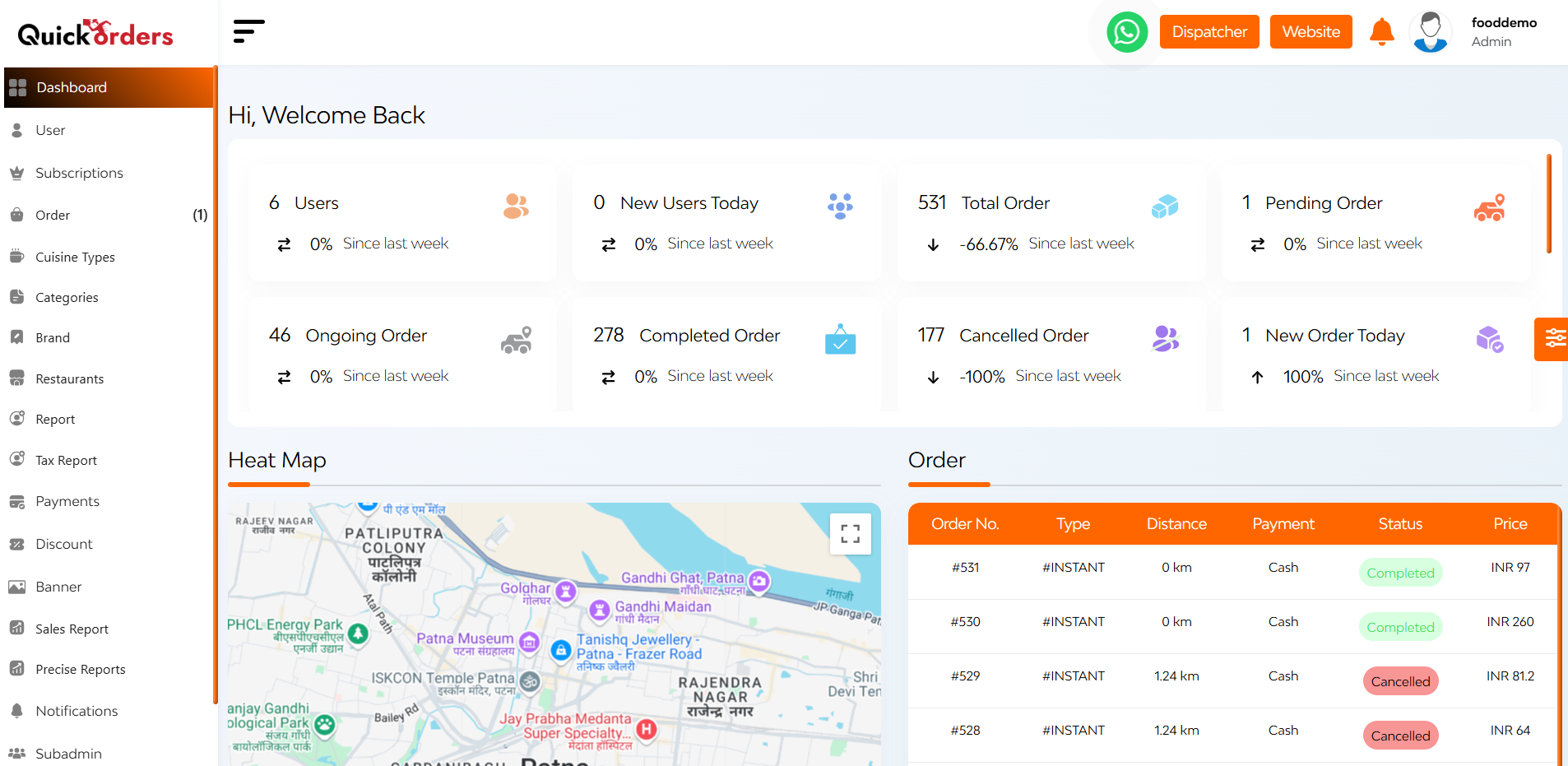
Upon successful login, the admin is presented with this dynamic admin dashboard.

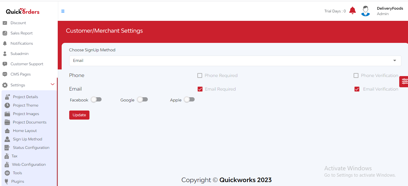
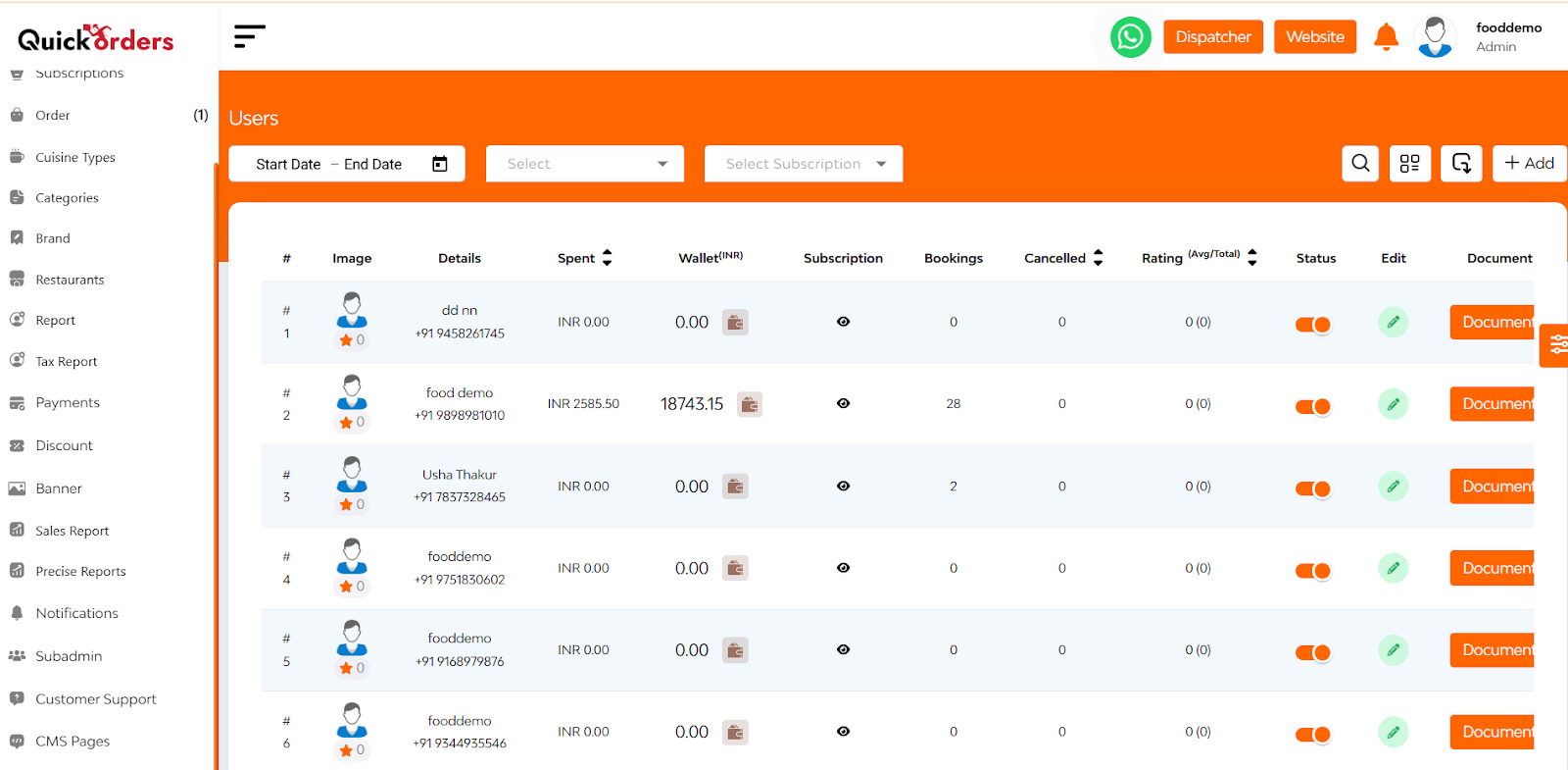
On the left side of the dashboard, there is a Navigation Sidebar that provides easy access to various features and modules within the platform.

On the right side of the dashboard, there is a Theme Customization Widget where you can toggle between light and dark modes and customize the color scheme of the sidebar and top bar.

At the centre of the dashboard has Interactive Feature Cards that display

  • Ongoing Order
  • Completed Order
  • Cancelled Order
  • New Order Today
  • Total Restaurants
  • Pending Restaurants
  • Cuisines Types
  • Category
  • Subcategory
  • Brand
  • Product
  • Deals
  • Coupons
  • New Reviews Today

Clicking on a card navigated to detailed information about that metric

Also there is a Heat Map and Order Section i.e. a visual representation of booking hotspots.

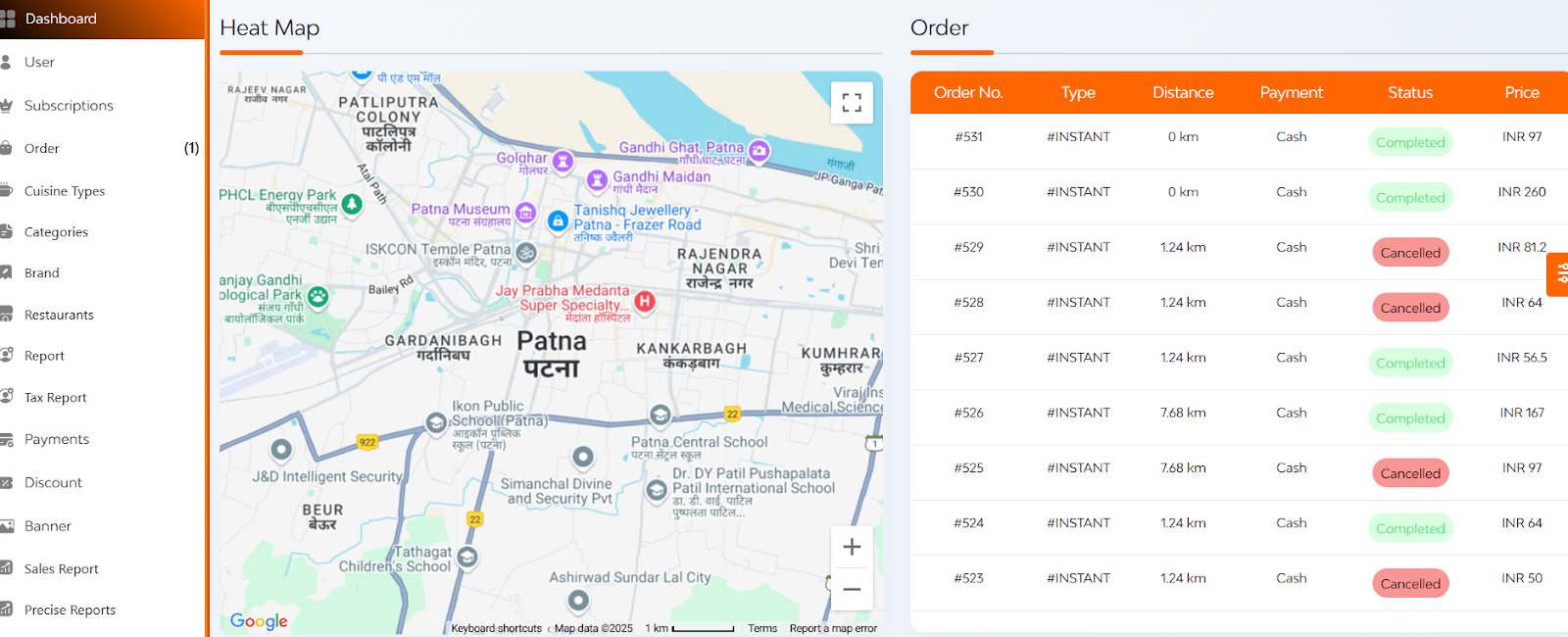
  • Highlights areas with high user activity
  • Indicates regions with the majority of bookings each month.
  • Quick view of orders on the basis of order number, type, distance, payment, status, price.

Below that you can see a pie chart and a bar graph

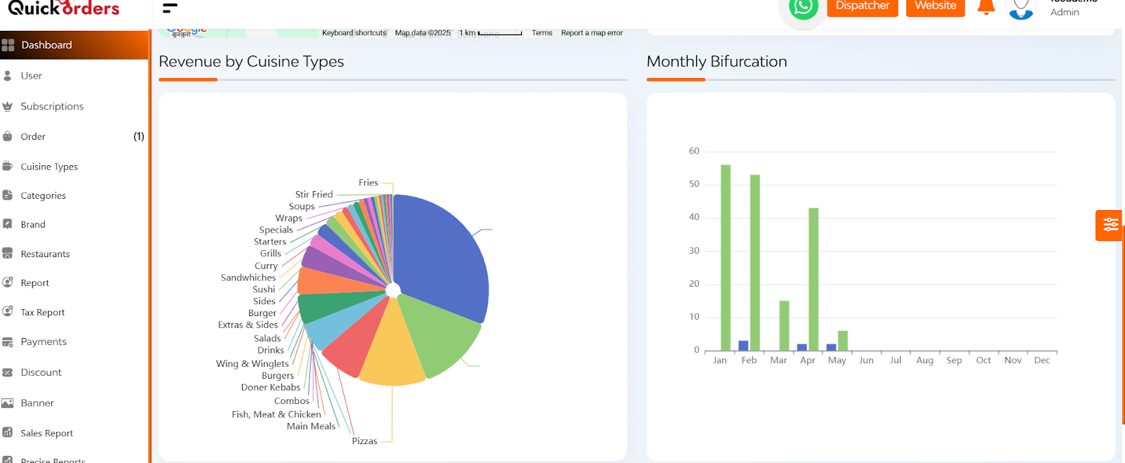
  • Here you can see the revenue generated by various cuisines types available and a bar graph which represents a monthly bifurcation on the basis of users and orders.

After that you can see the graphs regarding the cash and online revenue.

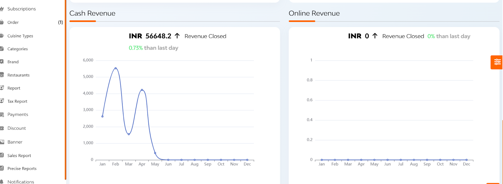
Here you can see the:

  • Cash and online revenue trends over days and hours within a month
  • Total income comparisons between the current and previous months

FAQ's

The dashboard provides a real-time overview of your platform’s performance. It helps you monitor key metrics like user activity, order statistics, restaurant status, and revenue, all from one place.

Each card displays a specific metric, such as:

  • Total Users
  • New Users Today
  • Total Orders
  • Pending/Ongoing/Completed/Cancelled Orders
  • Registered Restaurants (Total & Pending)
  • Cuisine Types, Categories, Brands, Products
  • Active Deals, Coupons, and Reviews

These cards not only show real-time data but are also clickable and redirect to their detailed sections.

All numbers shown on the dashboard are real-time. Any update made on the platform (like a new user sign-up or a cancelled order) is instantly reflected.

Clicking on a card takes you to a more detailed section related to that metric. For example, clicking on ‘Total Orders’ will open the complete order listing with filters, statuses, and order details.

The Heat Map visualizes order density by location. It highlights areas with the highest number of orders, helping admins analyze customer behavior and target specific regions for promotions or operational improvements.

Note: Location permission must be enabled to view the heat map.

The heat map is only visible if the device has location access enabled. Please ensure your browser or system allows location tracking for the platform.

You can view:

  • Order Number
  • Order Type (Instant or Scheduled)
  • Distance
  • Payment Mode (Cash or Online)
  • Real-time Status (Pending, Completed, Cancelled)
  • Total Price

This gives you a quick summary of all recent transactions on the platform.

It’s an interactive chart showing how much revenue each cuisine category is generating. You can click on any segment to see the name of the cuisine and the corresponding revenue amount.

This section displays how many orders users are placing each month. It helps track usage trends and monitor growth or drops in customer engagement over time.

There is a separate chart near the bottom of the dashboard titled ‘Cash vs Online Revenue’, which visually compares the two payment modes. It helps in understanding user preferences and managing financial operations accordingly.

While this walkthrough focuses on visual features, many dashboards offer export or reporting tools in their respective detailed sections. Please check under each specific tab (like Orders, Users, Revenue) for export options, or consult the platform support team.

The dashboard updates automatically in real-time. There’s no need to refresh the page manually.

Filters are generally available in the detailed sections (accessed by clicking the cards), not on the dashboard summary itself. From those sections, you can apply filters by date, status, type, etc.

Yes, the dashboard is designed to be responsive and can be accessed on both desktop and mobile devices. However, for optimal experience, it’s best viewed on larger screens.

The dashboard offers a quick, clear overview of platform health and user activity. With features like real-time metrics, geographical order trends, revenue insights, and user behavior, it enables faster and data-driven decision-making for administrators.